1Tonic
UX & UI Design
Guiding users through a complex licensing process with clarity and charm.
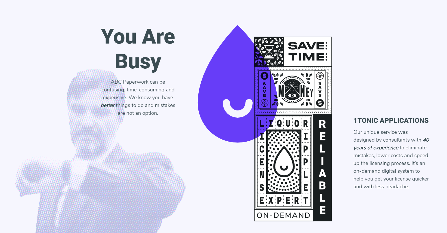
In Autumn of 2016, I entered into a formal partnership with three friends to work on a groundbreaking project in the liquor licensing industry. Our goal was to make filing liquor license applications easier by creating a guided online experience that would automatically fill out paperwork and walk the user through every step of the process. The current standard procedure is to hire a consultant and have them locate a license and complete the application, which can be very costly on top of the already-costly license itself.
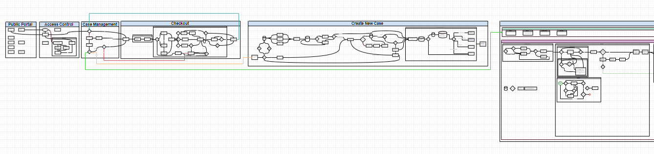
The first step in the process was to become acquainted with the licensing procedure as it exists today. There are a lot of stakeholders that would have the potential to interact with our software: applicants, brokers, escrow agents, alcoholic beverage control agents, and neighbors near the business location to name a few. For our initial release we decided to narrow our scope to provide one key “point” person, a Case Manager, with the tools they would need to get through their application.
After creating three user personas to guide us in meeting the needs of our target demographic, I sat down with a partner over the course of many months and mapped out our User Journey. We broke the module down into a mostly-linear flow that would help keep them from overwhelm and give them a task to be proactive on at every stage. The result of our months of work was a solid diagram of the entire licensing process, backed by plenty of companion Asana boards and JIRA tasks that we would need to tackle.
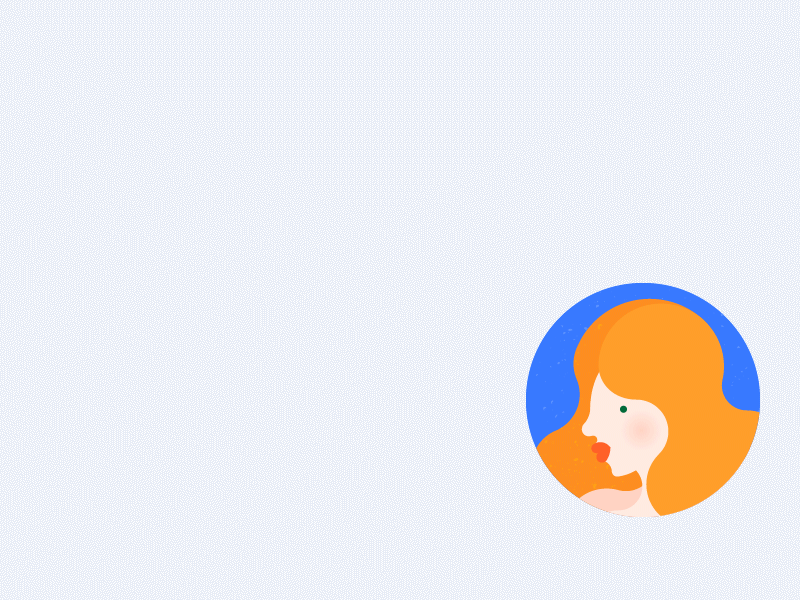
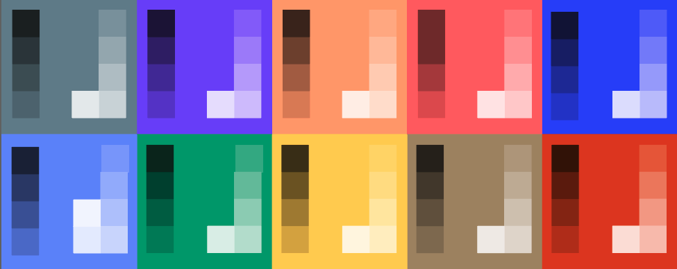
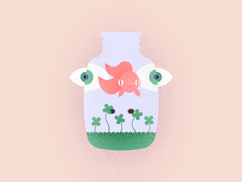
Alongside the User Journey diagram that we were crafting, I was investigating how our product should interact with the world. It was clear to our team that we wanted to provide a very different experience to the stark and unfriendly atmosphere current in the industry. We wanted something engaging, conversational, cheerful and dynamic. I started drafting some concepts based around an aquatic theme and a conversational-style method of input. In later drafts, the aquatic theme became more subdued and less child-like, but the groundwork had been laid for a friendly experience and a vibrant palette. I created a custom UI kit with a set of reusable controls that could combine to fit a variety of needs.
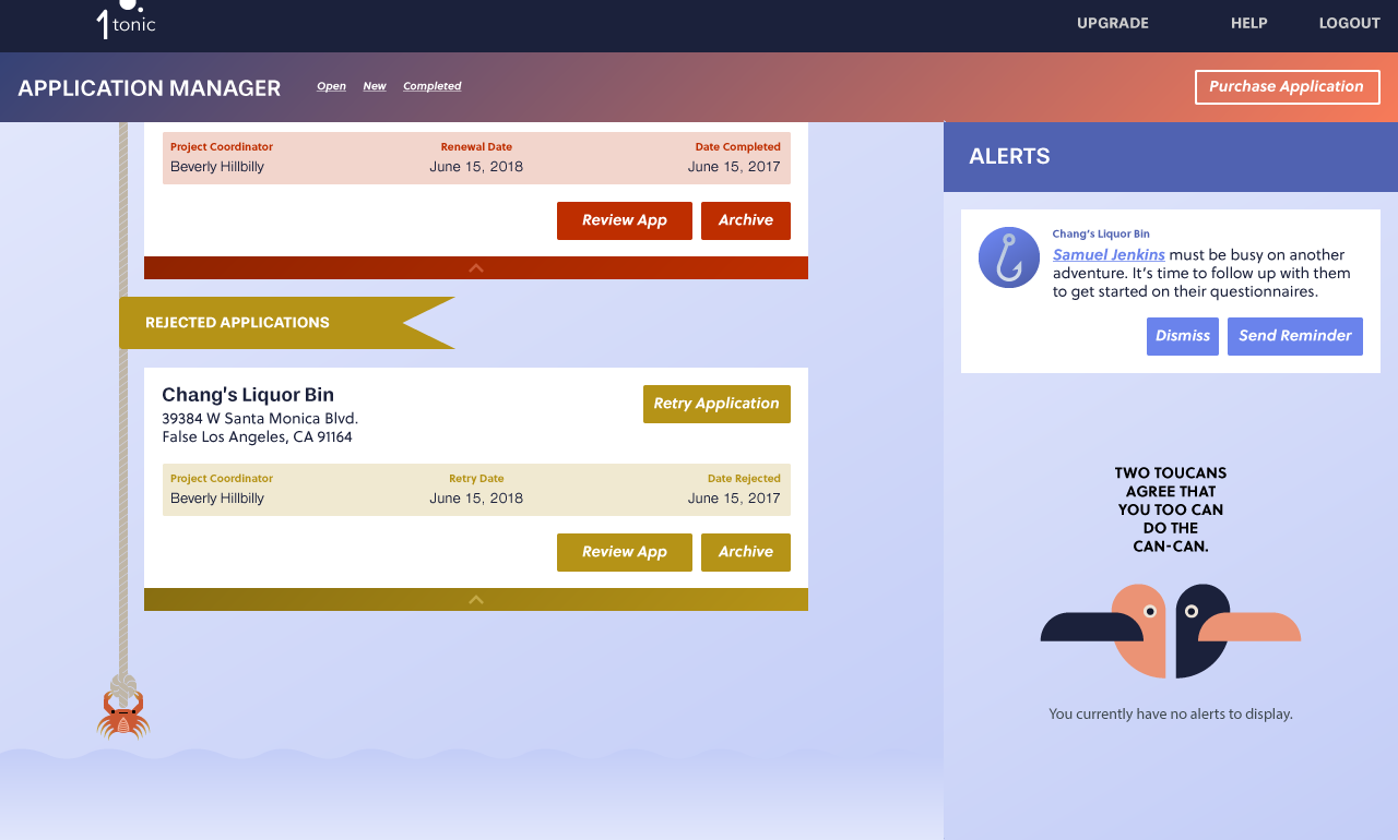
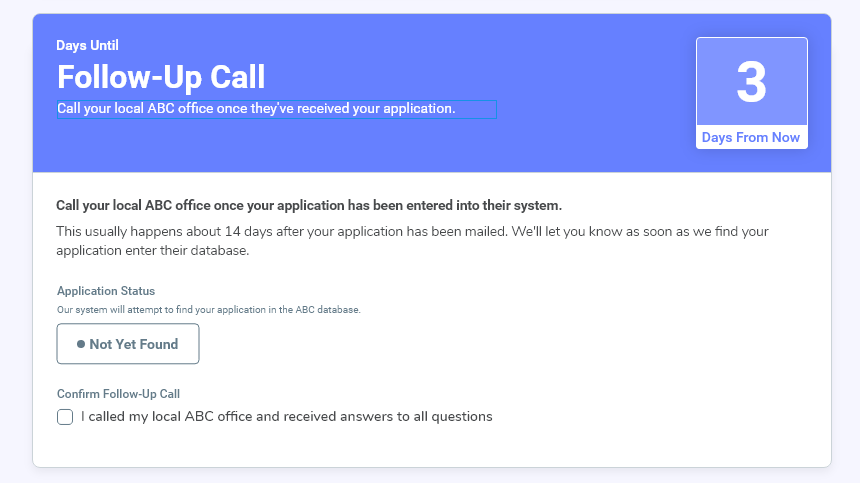
The home base for our users would be the dashboard, where they could easily springboard into their next task without any confusion. From the dashboard, they could also get an overview of the people involved in their application and a clear timeline with estimated completion dates. Each task, or “Questionnaire” was designed in a conversational way, since as users answered the questions we provided one by one, the following questions would change depending on their answers.
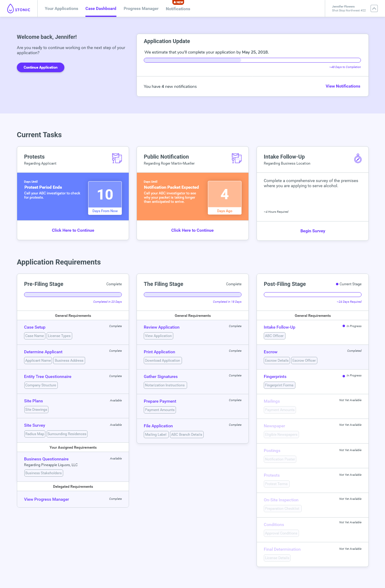

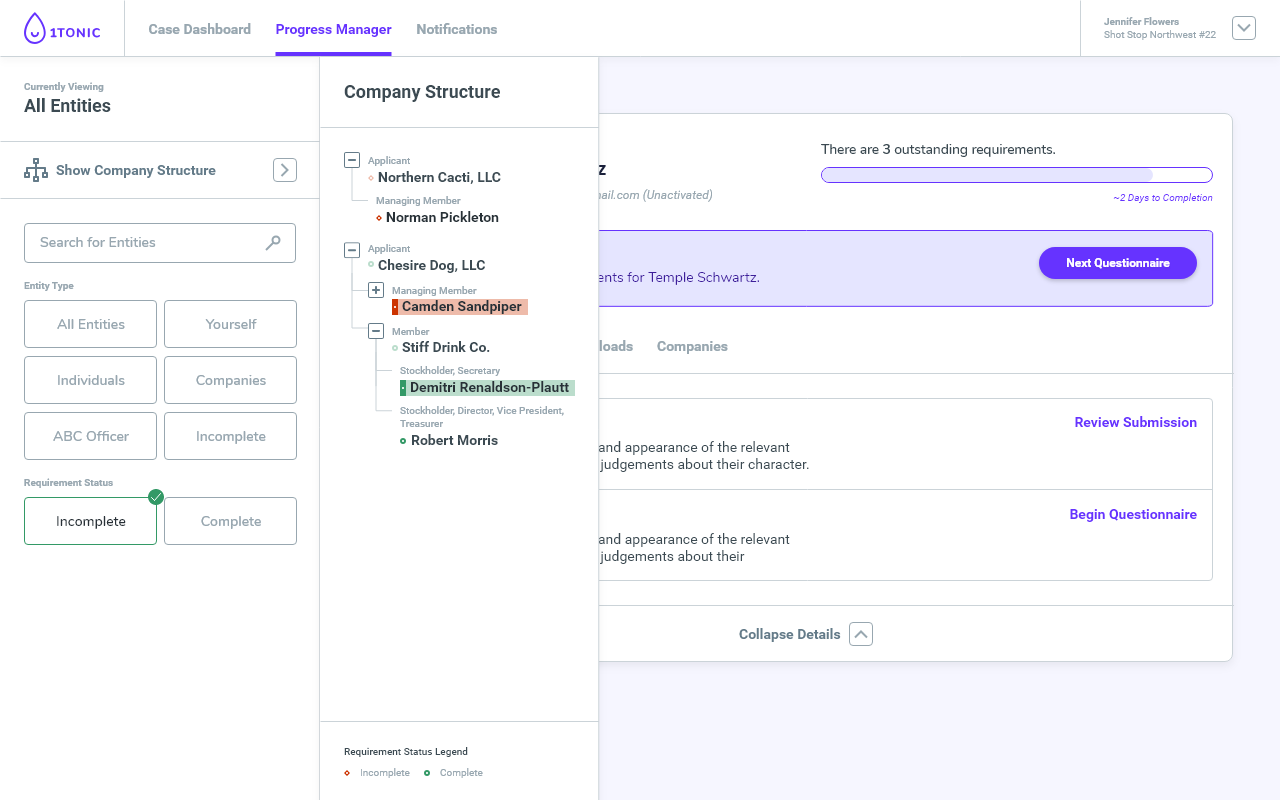
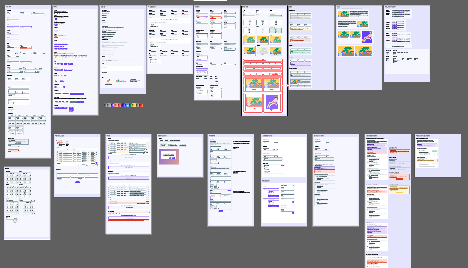
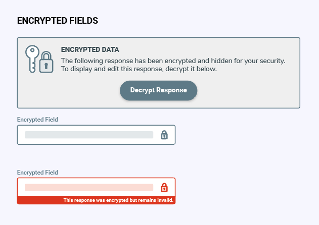
Each questionnaire was designed to gather input from users in the simplest way possible by chunking related information together. There was a lot of diversity in the types of answers and the amount of data we would need to collect, so the intricacy the UI controls reached far beyond simple dropdowns and checkboxes. I got crafty in creating dynamic timers, encrypted inputs and tables.

Branding & Identity Design
Encapsulating our product's story in an ideogram.
A friendly and bold brand was beginning to take shape, so the brandmark became a priority. The early drafts were bold and eye-catching in their own way, but lacked a bit of the character and recall that I wanted while still saying something about our product.
What resulted was our “zen droplet” that came to represent the sense of peace, balance and even delight when a project is going smoothly. Our droplet signifies the one tonic that will guide users through to their liquor license without headache and confusion.
Landing Page & Video Animation
Building a WordPress, transactional emails, and summary video to launch our first product.
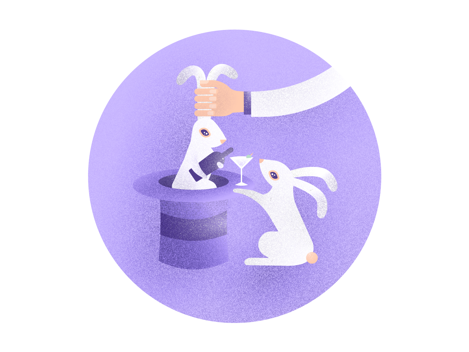
Once the brandmark was completed, I set up a WordPress landing page as we began to launch our Priority Application product: a free service to help users enter the California liquor license lottery. I spent a significant amount of time coding out HTML email templates to get users into our system and share their lottery drawing results. The key focus during our initial launch was to provide FAQs and use a summary video to explain the process.
I created a simple video using some of the design assets I had created around our theme of magic to outline how users could enter the lottery.
Visual Design
Bringing a graceful presence to an audience that's tired of jumping through hoops.
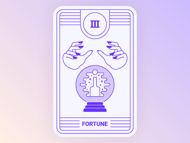
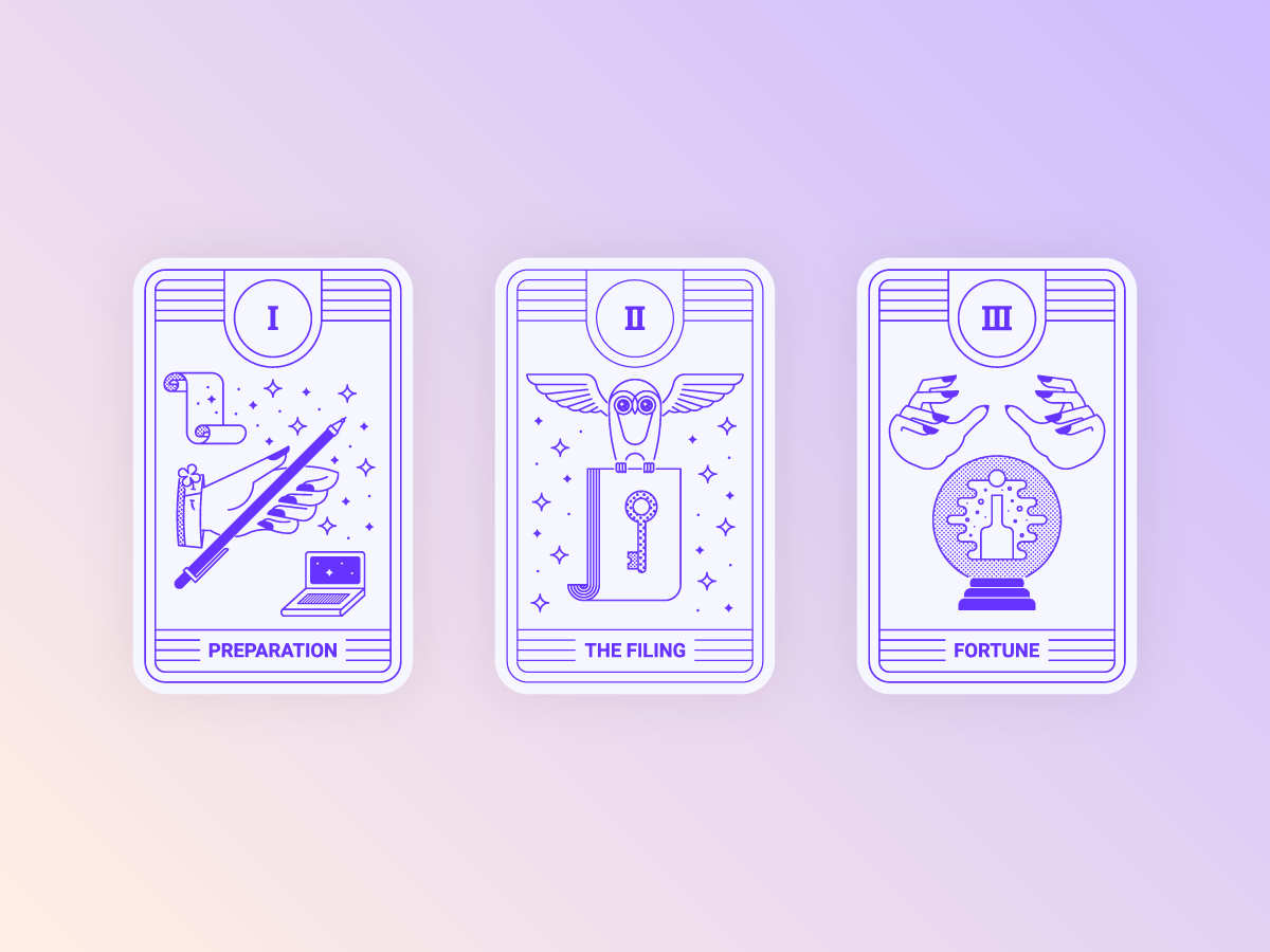
One of the highlights of this project is creating visual assets that bring a lot of character into something that can be tedious and time-consuming. I like to think of creating original visuals that break up the mundane and provoke thought as a way to not only delight users, but also to express gratitude.

Deliverables
- UX User Journey Map
- Wireframes, Webpage Mockups & UI Design
- Logo & Branding
- Illustrations & Iconography
- Animated Product Video
- Printable HTML Forms & Labels
- WordPress Website
- HTML Email Templates
Software Used
- Adobe Illustrator
- Adobe Photoshop
- Adobe XD
- Adobe After Effects
- Adobe Audition
- Visual Studio
- DrawIO