IRC Seattle
The refugee crisis has moved front and center on the world stage over the past few years as one of the top humanitarian issues. When it was reaching its peak as a digital media in late 2015 (according to Google Trends), I knew I wanted to do something to take action and to learn more about the experiences of refugees and the people working to help them.
The International Rescue Committee (IRC) is a global organization that not only provides humanitarian aid out in the field, but is also tasked with helping asylum-seekers with the resettlement process. I began volunteering in their Seattle office working at their front desk in early 2016, moving on to offer my design services to volunteer on a variety of projects. My goal was to help communicate them their message in a more approachable and human way, specifically tailoring materials to the Seattle location.
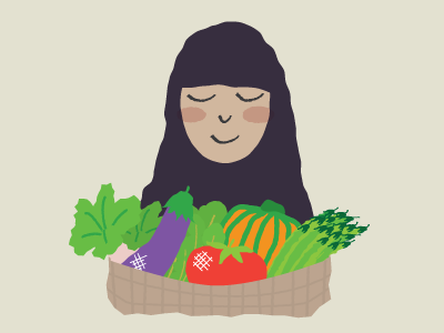
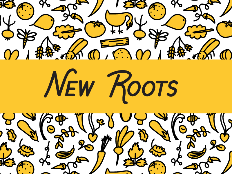
New Roots Program Pamphlet
Encouraging donations by building a warm & relatable identity.
IRC’s New Roots Program provides refugees with the opportunity to garden in their communities. Many come from cultures where subsistence farming is commonplace, and having space and materials to garden makes the resettlement transition much easier. The fun of creating illustrations paired with setting generous copy to create a balanced flyer made this project really satisfying. I was proud to hand the flyer out myself and a local event to help spread awareness about the community gardens. I’m also delighted and surprised to see the illustrations reused on their own in several pieces the IRC has put out since, becoming a recognizable element of the New Roots Program.

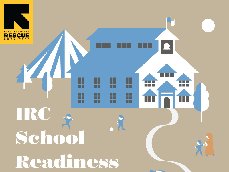
School Readiness Program Pamphlet
Communicating the successes of a crucial program to potential funders.
The director of the IRC Seattle’s School Readiness Program was looking to create a four-page pamphlet that would show the successes of the programs and showcase some of what community members were saying about the program. The resulting combination of illustration, typography and data visualization made for an informative and engaging piece that the Program could deliver to stakeholders and potential donors.
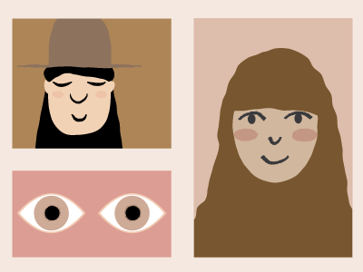
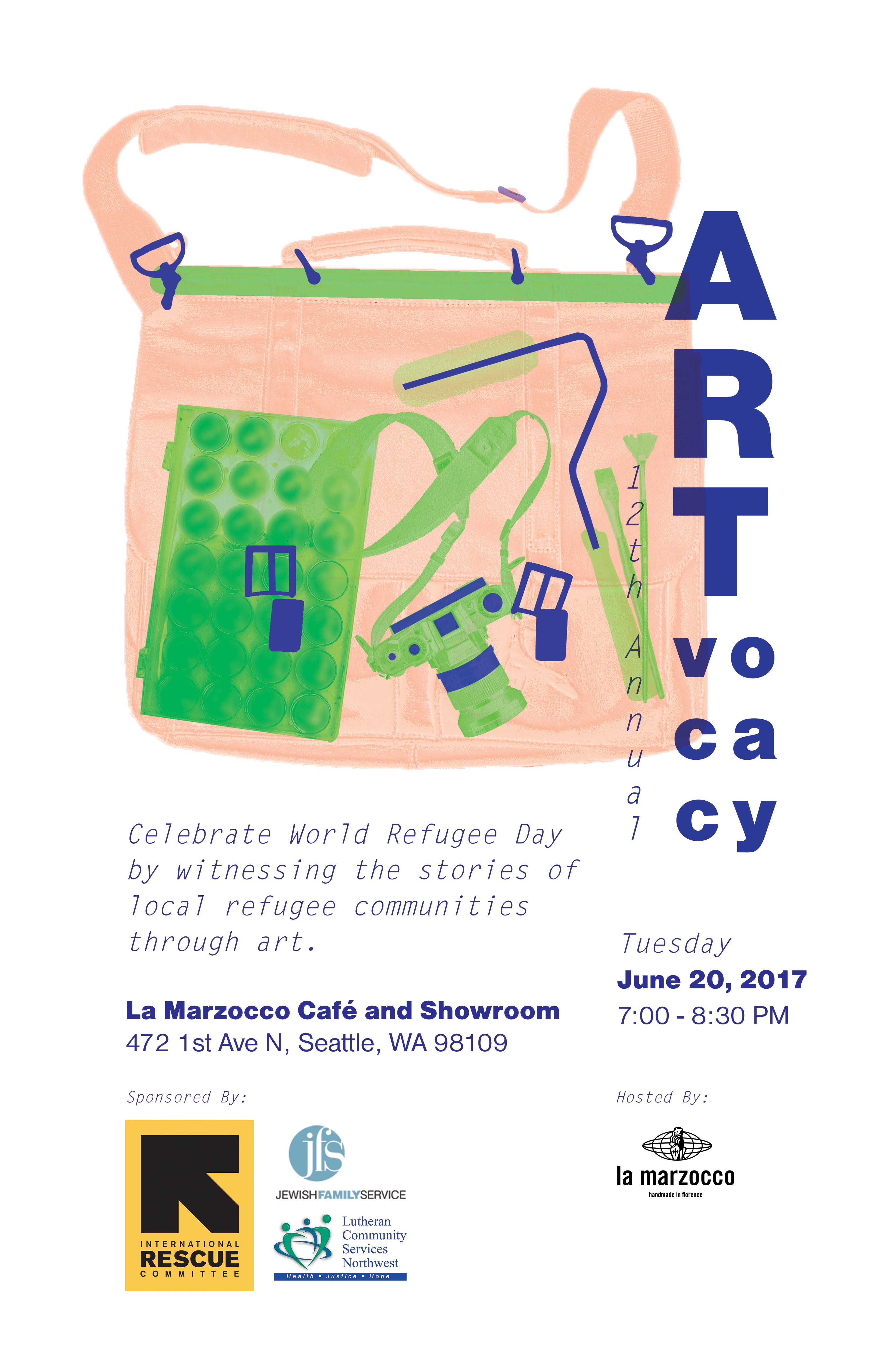
ARTVocacy Posters
Inviting the local community to celebrate World Refugee Day.
Each year, the IRC puts on an event showing art created by refugees who have resettled in the local community. I was delighted to be asked to design the event posters for 2016 and 2017. My inspiration for the 2016 poster came from diversity in skin tones and stories fitting into a community grid. For 2017, it came from airport luggage scanners: there are a lot of misconceptions about what refugees bring along when they resettle. The most valuable are their cultures and stories.
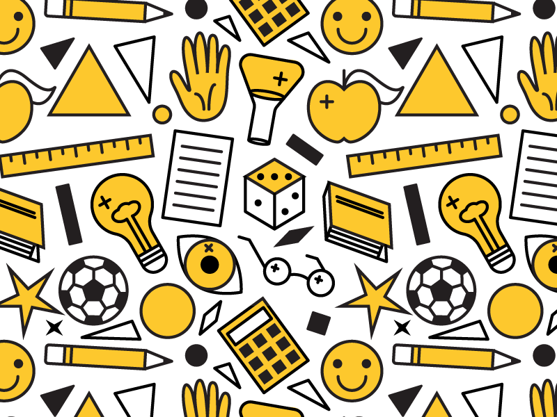
Pattern Tiles & Microsoft Word Templates
Providing easy and fun reusable materials for grant-writing & outreach.
When sending out pamphlets or project proposals, the various IRC programs wanted to have something that would look be more eye-catching and fun while still fitting into the existing IRC brand. I created a few editable templates that could be easily used by anyone on the team, regardless of their software knowledge. The pattern tiles I created could be reused on other projects and are recognizable as part of the IRC while lending some extra personality.
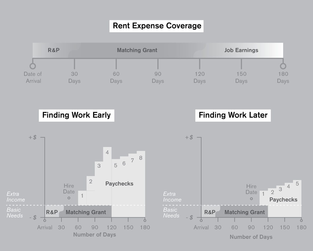
Employment Assistance Graphic
Maximizing resources by minimizing complexity and color.
This graphic is an example of working within tight constraints to provide the most benefit to the client. The Employment Readiness Program was tired of drawing and redrawing a certain graph on the whiteboard each time they made a presentation. It would be more efficient to communicate with a visual that could be reprinted, but in black and white at low cost. I managed to create a graphic that was both as accurate as possible and fit within the requirements.
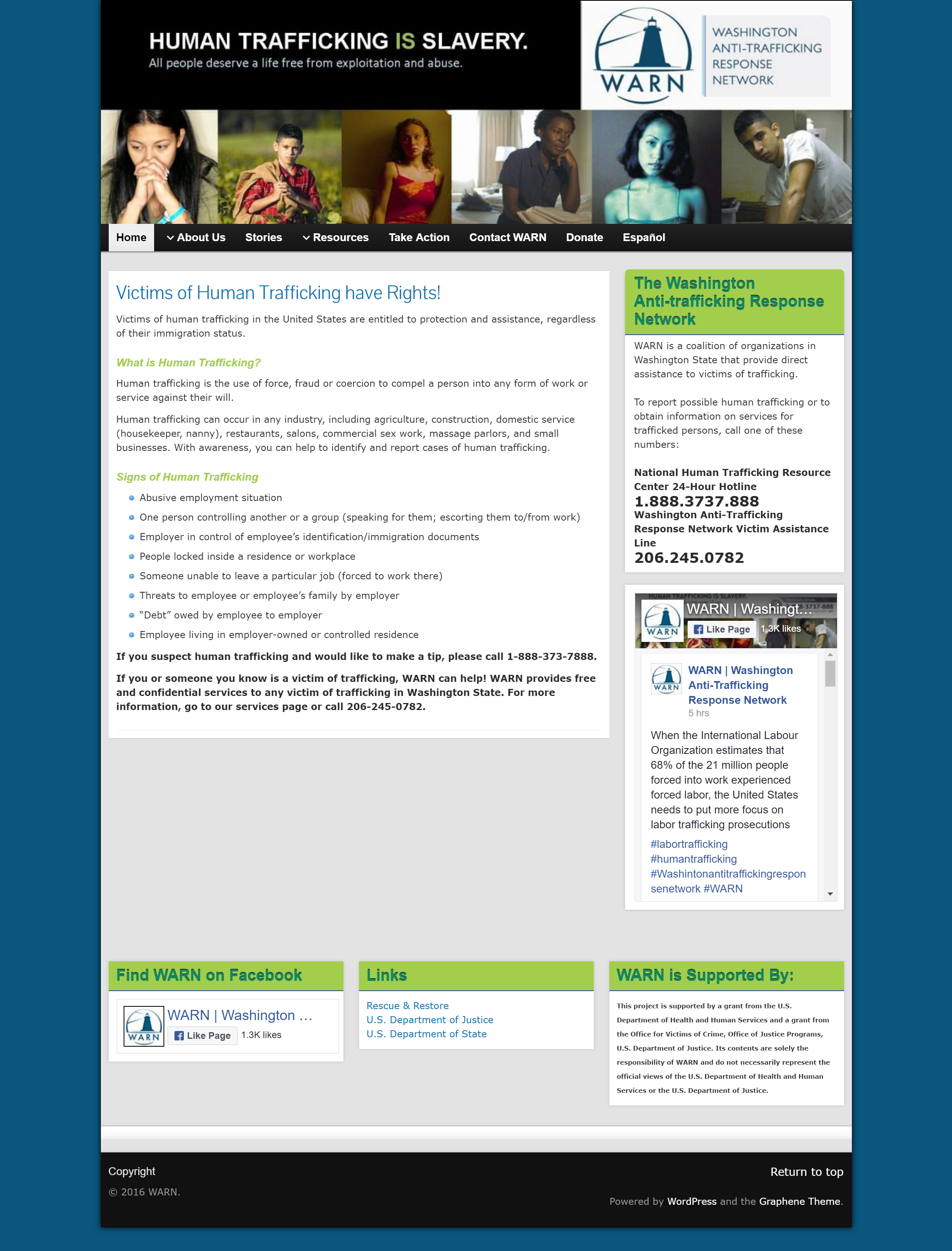
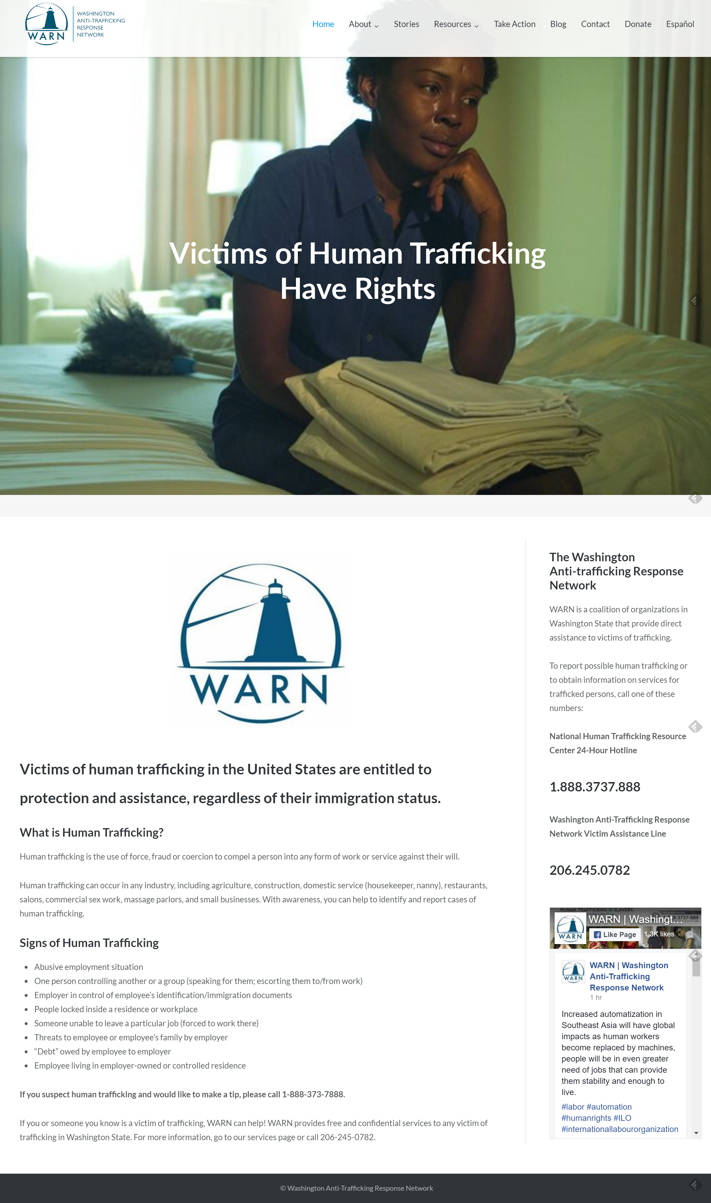
WARN WordPress Update
Encapsulating our product's story in an ideogram.
Washington Anti-Trafficking Response Network has a small team in the IRC’s office, and they were intent on updating their WordPress site to be more modern and user-friendly while avoiding any costs. One of my biggest concerns about the existing site was the readability: parts of the text fell below acceptable contrast ratios. I also felt that the identity was obscured by the competing color schemes and lack of visual hierarchy. I implemented a new theme for them that dealt with those two key issues and improved the clarity of their message.
Software Used
- Adobe Illustrator
- Adobe Photoshop
- Adobe InDesign
- WordPress
- Microsoft Word